Chaos to Clarity in Technical Documentation
Explore how I integrated guides, interactive tutorials, and clear API insights into an intuitive architecture, alongside extensive SEO practices to ensure users could easily find and locate items. Additionally, I incorporated a variety of images, a comprehensive glossary, and interactive content to create an extensive documentation resource tailored for both beginners and advanced users of the SaaS platform.
2023
Year
Senior Product Designer (end-to-end), Writer
Role
Desktop, Tablet
Platform
8 Weeks
Duration
Stakeholders, Developers, Engineers, Advisors
Collaborators
Figma, Sketch, Jira, HotJar
Stack
Problem
Our SaaS tool serves a diverse user base, including beginner data scientists, experienced programmers, and advanced data scientists. These users frequently raise support tickets due to confusion with the tool’s functionalities. To address this, we needed to develop comprehensive documentation that provides clear examples and is tailored to users at varying skill levels.
Solution
We needed to develop a robust documentation system. This system required the creation of clear, step-by-step guides and practical examples that cater to different skill levels, ensuring that users could effectively navigate and utilize the tool on their own. The challenge lay in transforming intricate technical information into content that is both easily understandable and engaging for users with varying expertise. We needed to balance simplicity with depth, ensuring that the documentation was intuitive and could support effective self-troubleshooting, thus reducing reliance on support tickets and enhancing overall user satisfaction.
Expectation
An easily accessible tool for users to find straightforward examples related to product design. The idea was that users could quickly reference text-based examples for guidance.
The design would involve primarily static text with a few examples, assuming that minimal user interaction would be sufficient for the tool’s purpose.
The tool was envisioned to be easily implemented using a private site, with minimal technical complications or additional requirements.
Reality
Users required more engaging and detailed visual aids. This included interactive graphics, animations, and comprehensive visual explanations to better understand complex concepts.
There was a high demand for interactive and practical examples. Users needed interactive elements such as sandbox environments for coding practice, with tiered levels of complexity to better engage and educate them.
Stakeholders requested a secure system with user privacy controls, requiring custom CMS functionality and advanced SEO features for better accessibility and searchability.
SEO Challenges: Beyond basic design, SEO became a critical component. The tool needed robust search functionality to ensure users could efficiently find the information they needed. This included creating a comprehensive glossary, detailed definitions, and interlinked pages akin to a mini-Wikipedia.
Results and Impact
Accomplished a 22% decrease in customer support issues, easing the load on our support staff significantly. User contentment rocketed to a remarkable 84% after the improved documentation was implemented. Evaluation Technique: Success was measured by dwindling issue tickets and evaluated through feedback surveys coupled with satisfaction ratings. These indicators endorsed the triumph of our restructured documentation approach.
Design Approach
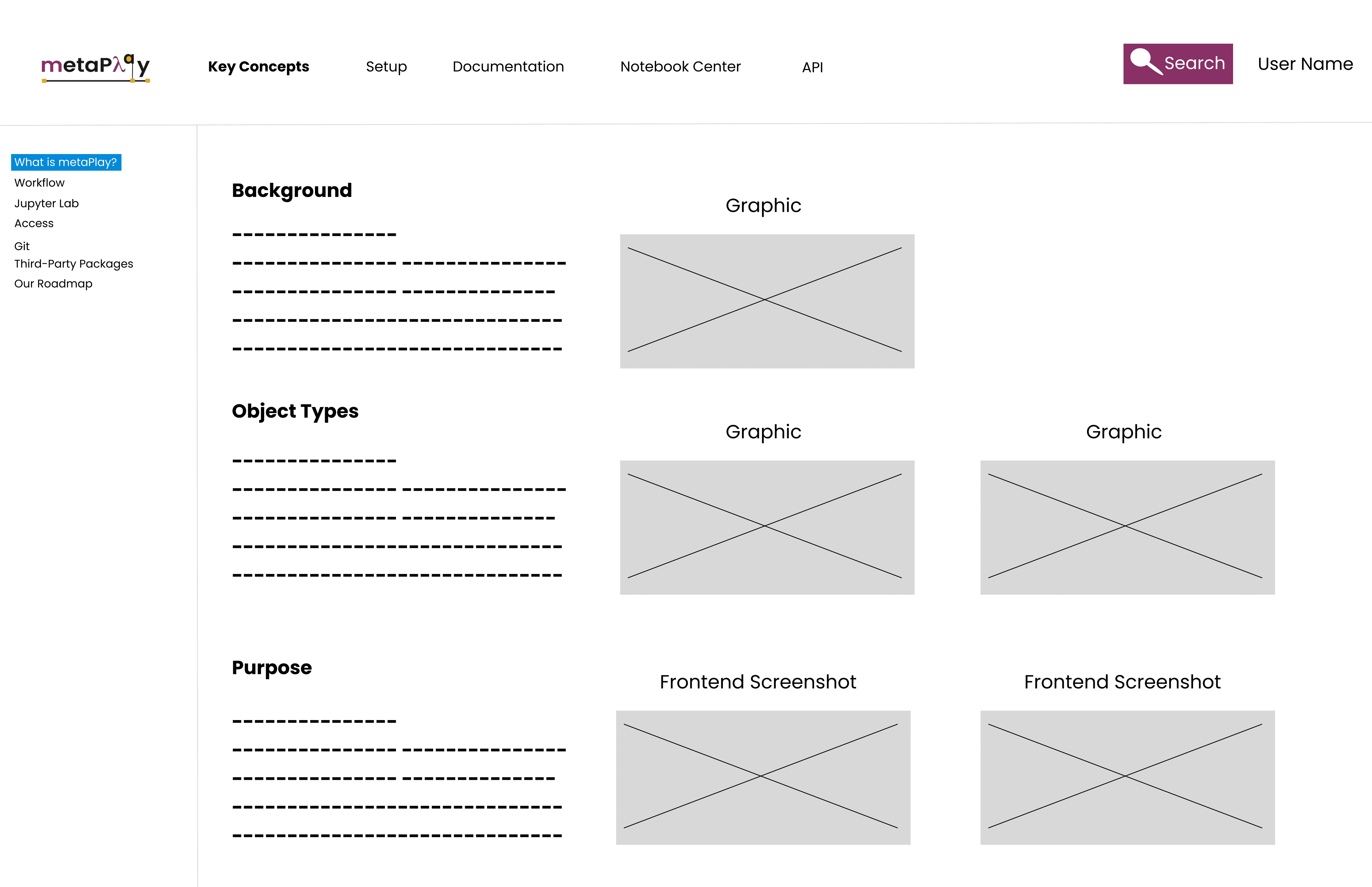
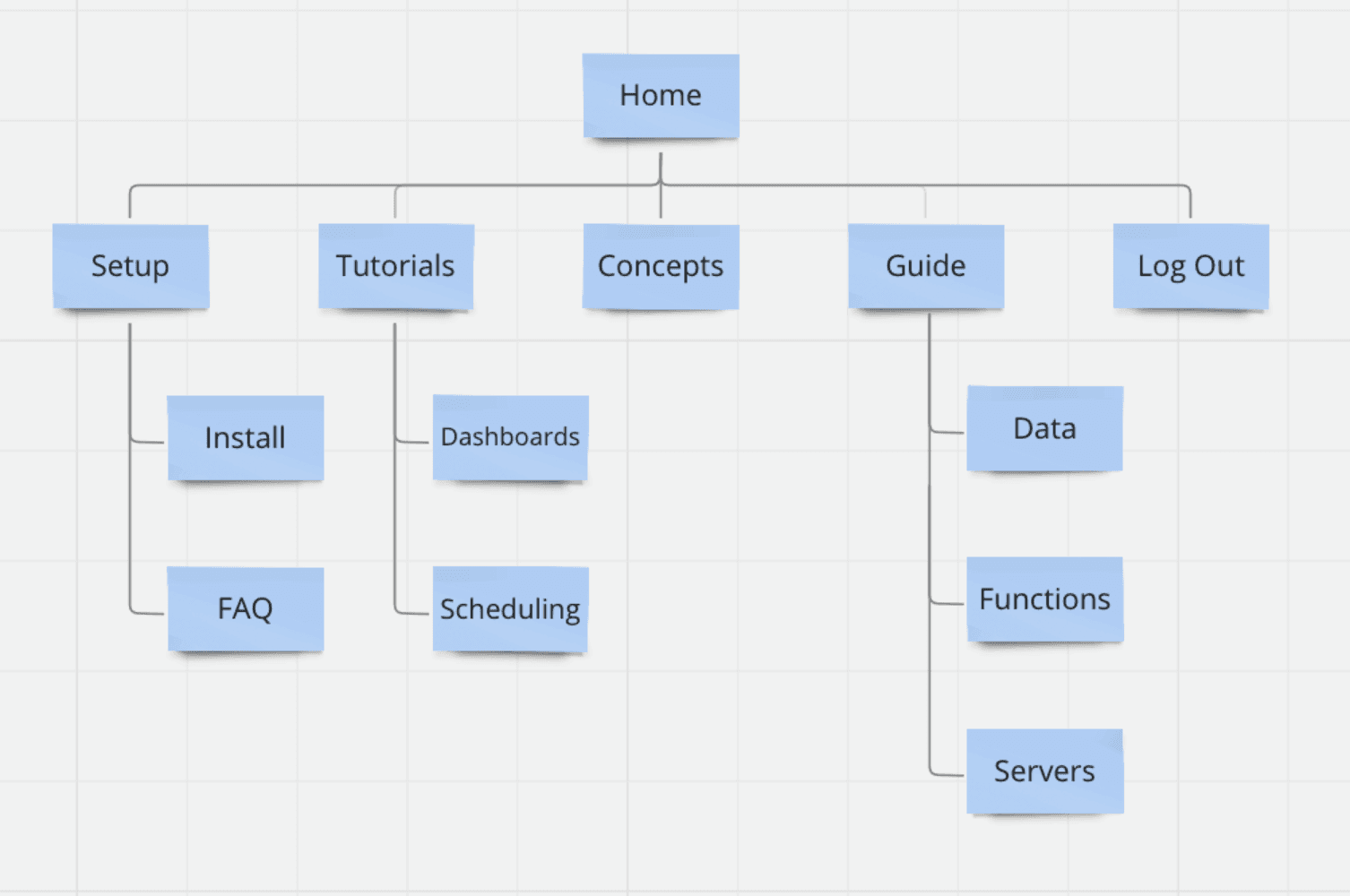
Usability testing showed that the initial layout was confusing and overwhelming for users. We needed to our tailor our layout to follow how users were seeking information. Sessions showed that users immediately searched for installation guides, and it was clear that needed to be the landing page. Notebook Center was replaced with Tutorials, and Deep Guide came last, with longer, detailed content explanations.
Shipped Solution
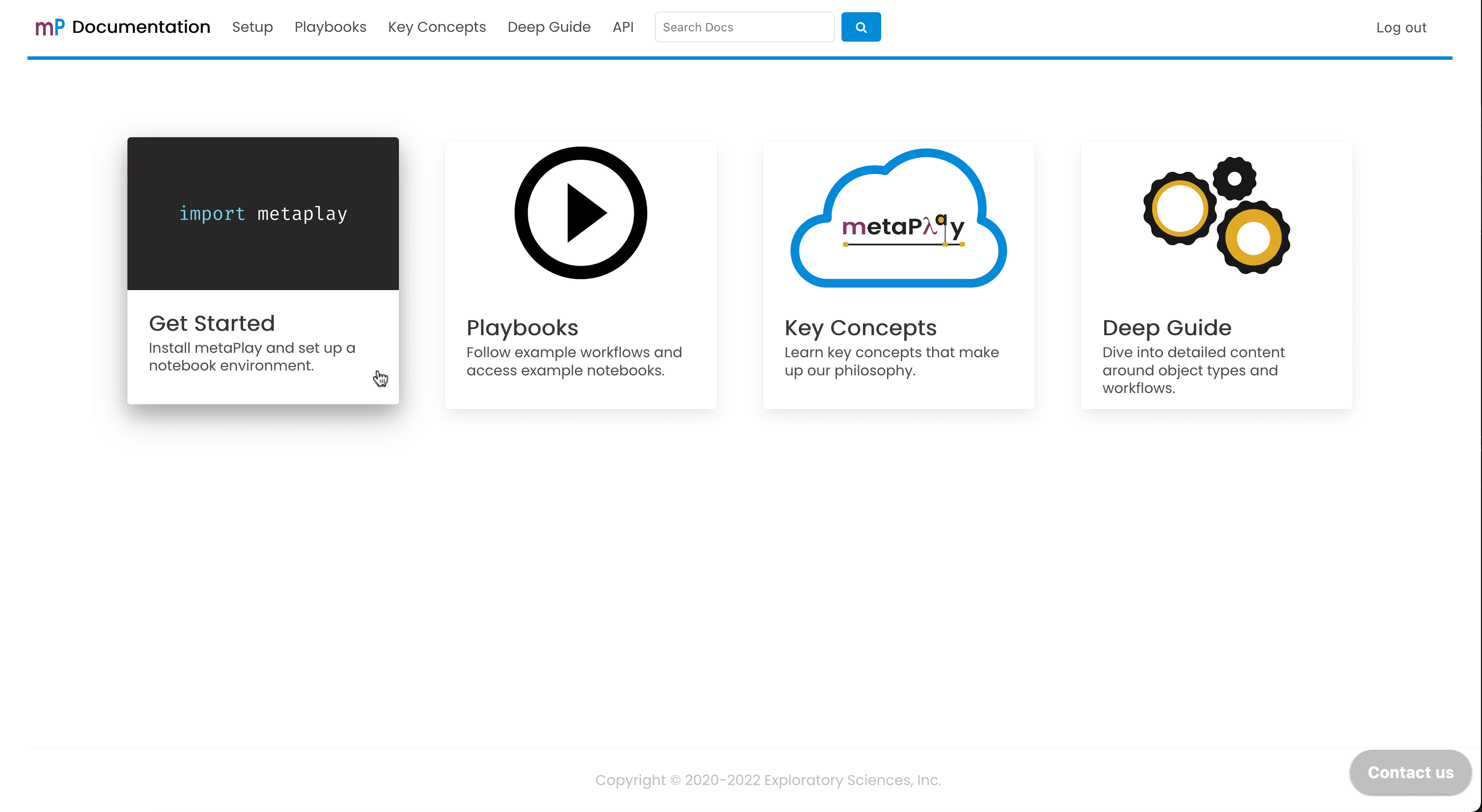
The home screen offers tailored navigation, catering to users' needs at every knowledge level.
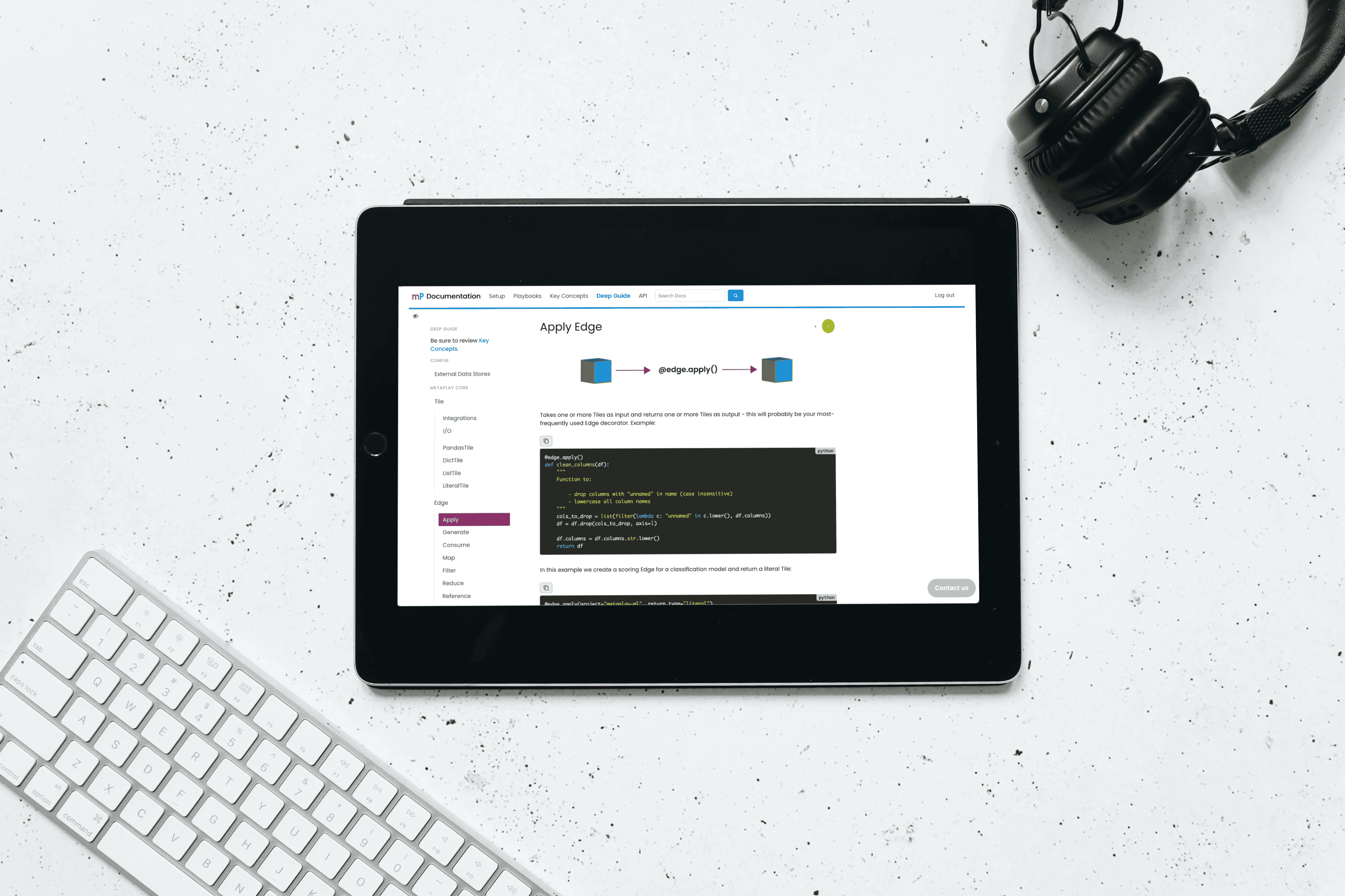
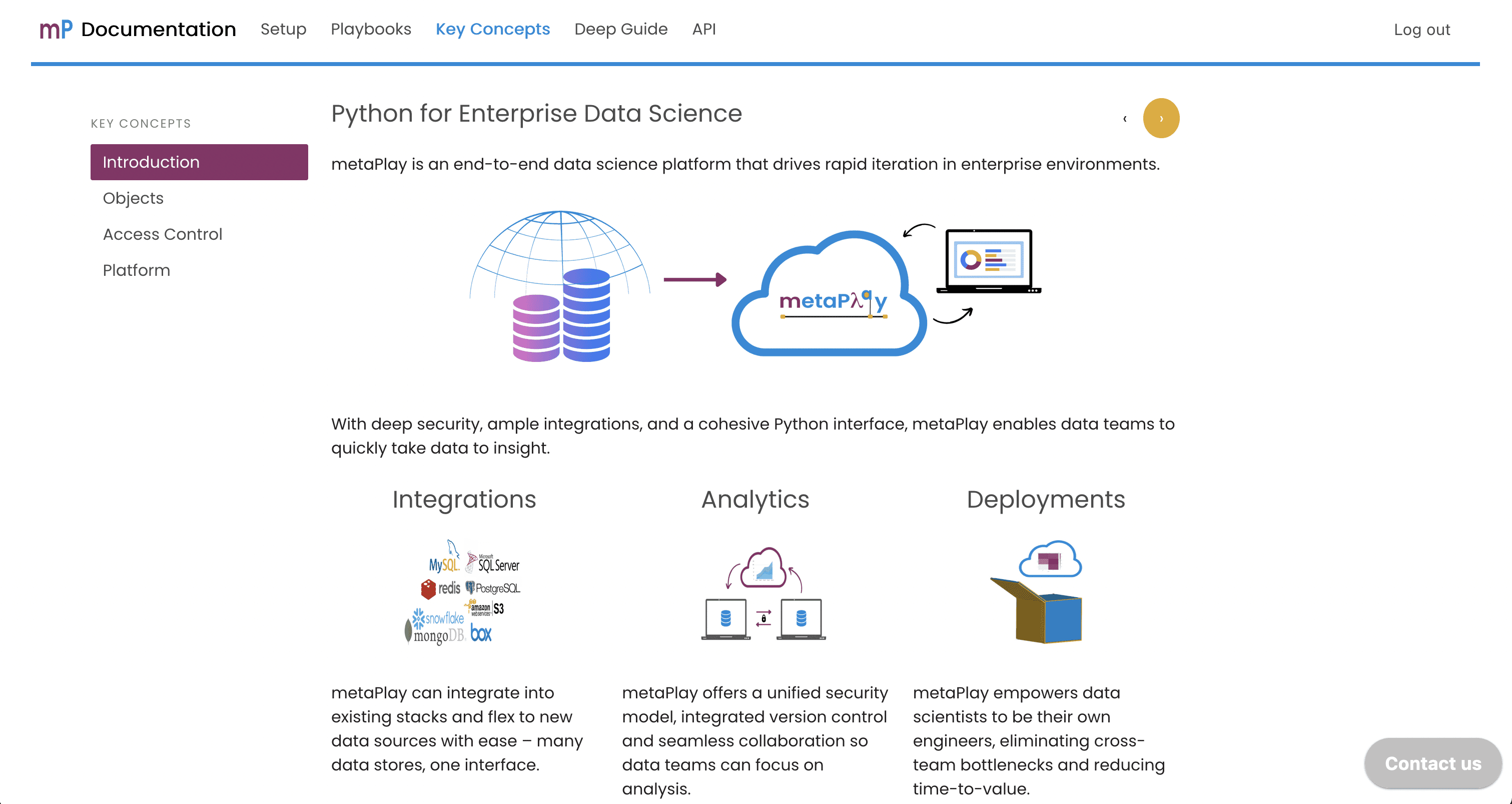
I orchestrated the layout like a well-structured book, employing top navigation for main sections and sidebar navigation for individual chapters, providing users with clear visual cues of their location.
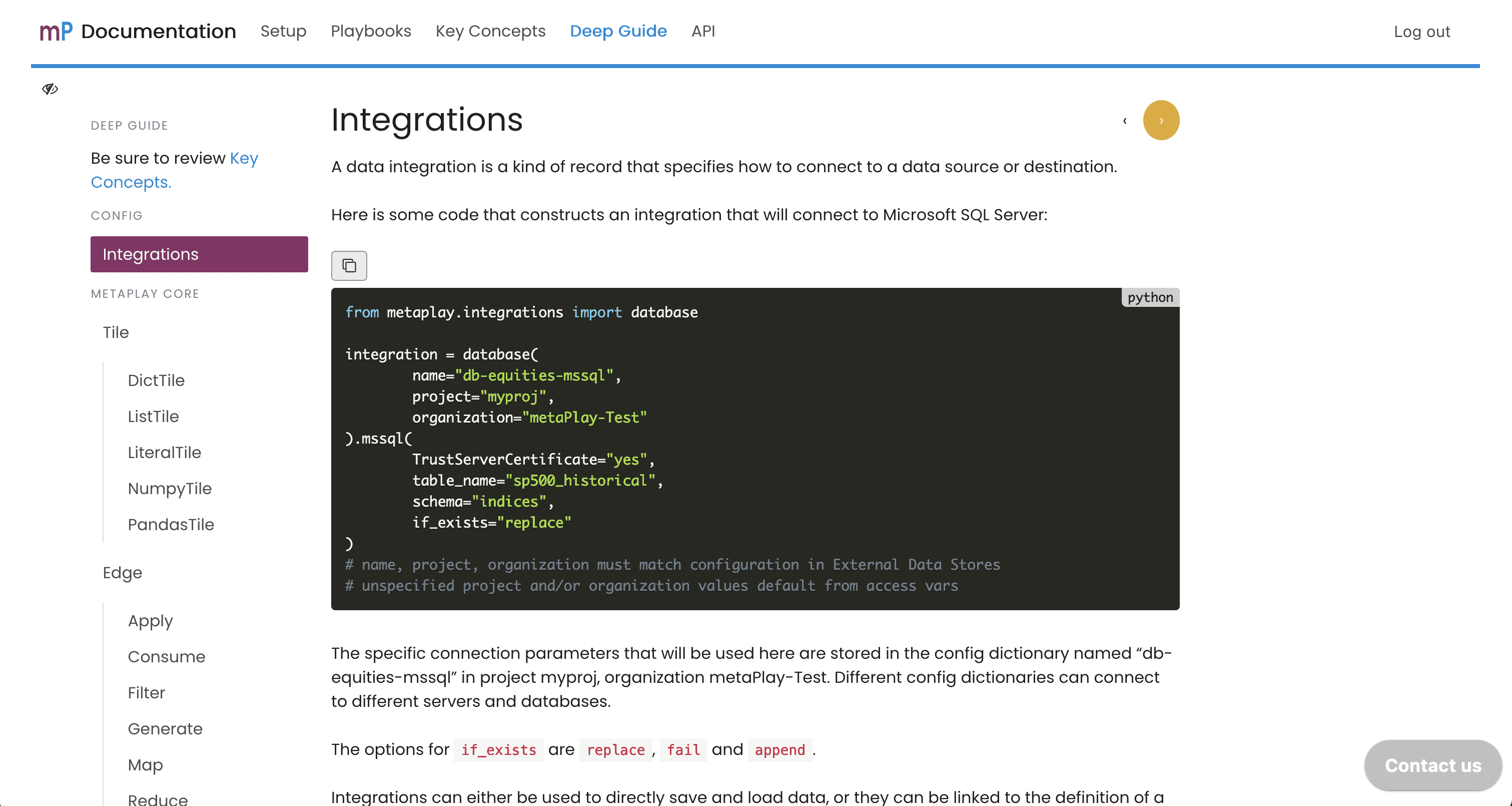
I enhanced the example code sections by accentuating programming language syntax and implementing a 'Copy to Clipboard' feature for seamless usability:
Lessons Learned
This project taught me the power of collaborative problem-solving, particularly in addressing complex CMS configurations through teamwork with developers and the implementation of a headless CMS.
Automation emerged as a key asset in maintaining quality. For instance, a script that automated code snippet testing proved invaluable in ensuring consistency and accuracy.
Embracing adaptability and continuous improvement became central to my design philosophy. This experience guided me towards creating technically robust and user-centered solutions, highlighting the importance of flexibility and iterative enhancement in achieving project goals.
